WPF in .NET 9.0: The Accent Color
In the last blog post about WPF in .NET 9.0, you learned about Windows 11 Theming. In this blog post, let’s take a look at another feature of WPF in .NET 9.0: The Accent Color.
What Is the Accent Color?
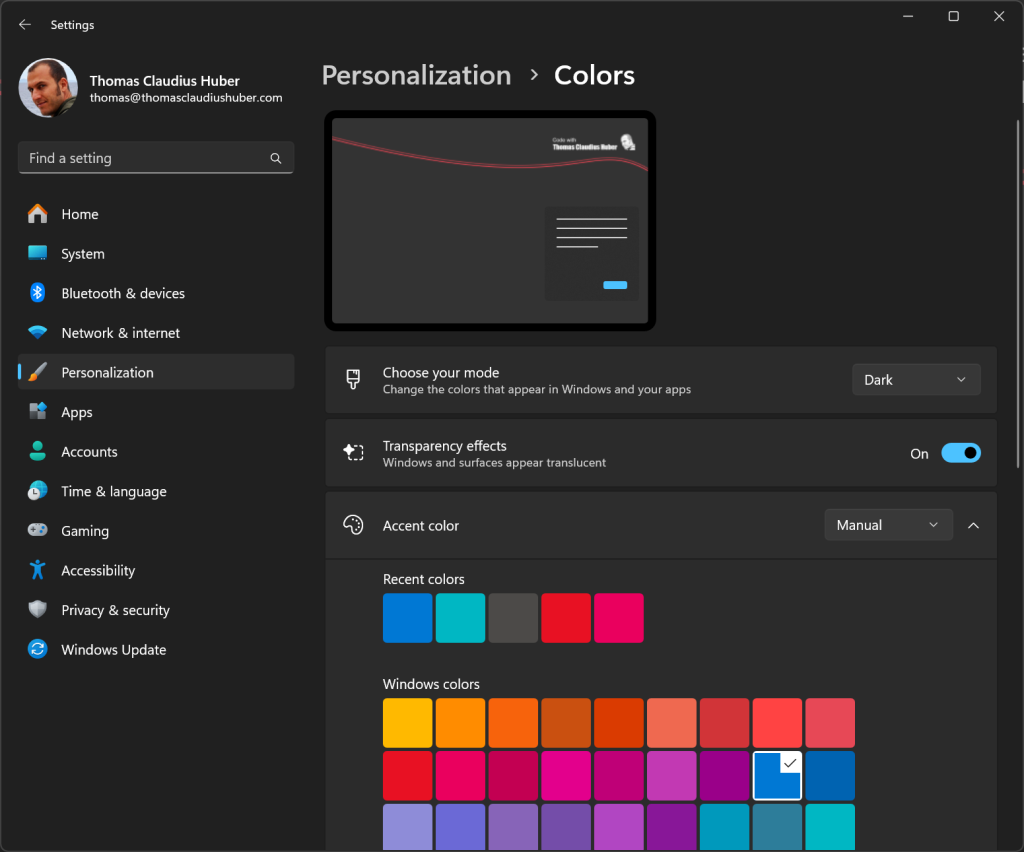
In the Windows Settings, under Personalization -> Colors, a user can select an accent color. In the screenshot below you can see that I selected blue as my accent color.
So, for what exactly is that accent color used? The Microsoft documentation say this about the accent color:
The accent color is used to highlight important elements in the user interface, such as buttons, links, and other interactive components. The color can be customized to match your personal preference or to complement the overall theme of your device. By selecting an accent color, you can add a touch of personality to your interface, making it more engaging and visually cohesive.
https://support.microsoft.com/en-us/windows/personalize-your-colors-in-windows-3290d30f-d064-5cfe-6470-2fe9c6533e37
So, you see, it’s a color independent from the chosen Windows 11 Theme for highlighting buttons, links, active elements in lists etc. And with WPF in .NET 9.0, you have access to that accent color.
Use the Accent Color in WPF
Since .NET 9.0, you can use the accent color in WPF. It doesn’t matter if you’re using the Windows 11 Theme in your WPF app or not.
The accent color selected by the user in the Windows Settings is available via WPF’s static SystemColors class (Namespace: System.Windows).
There are four new static properties in the SystemColors class:
AccentColor(Type:Color)AccentColorKey(Type:ResourceKey)AccentColorBrush(Type:SolidColorBrush)AccentColorBrushKey(Type:ResourceKey)
The properties AccentColor and AccentColorBrush are great if you need access to the Color or Brush object in C#. The AccentColorKey and AccentColorBrushKey properties are fantastic for XAML, as they allow you to reference the Color or the Brush with the DynamicResource markup extension. Before we look at a code sample, there’s one more thing:
Besides the accent color as such, there exist also 3 light variants and 3 dark variants of the color. This means that the SystemColors class has also the following properties for the Light1 variant:
AccentColorLight1AccentColorLight1KeyAccentColorLight1BrushAccentColorLight1BrushKey
You can replace Light1 with Light2, Light3, Dark1, Dark2, and Dark3 to get all the variants. Light3 is the lightest, Dark3 is the darkest.
A Code Sample
Now let’s look at a code sample. Go ahead and create a new WPF project that targets .NET 9.0 or later. Then place the following WrapPanel in the MainWindow.xaml file inside the default Grid element (Or you can also replace the Grid element with this WrapPanel).
<WrapPanel ItemWidth="100" ItemHeight="100" Margin="10">
<Border Background="{DynamicResource {x:Static SystemColors.AccentColorDark3BrushKey}}" />
<Border Background="{DynamicResource {x:Static SystemColors.AccentColorDark2BrushKey}}" />
<Border Background="{DynamicResource {x:Static SystemColors.AccentColorDark1BrushKey}}" />
<Border Background="{DynamicResource {x:Static SystemColors.AccentColorBrushKey}}" />
<Border Background="{DynamicResource {x:Static SystemColors.AccentColorLight1BrushKey}}" />
<Border Background="{DynamicResource {x:Static SystemColors.AccentColorLight2BrushKey}}" />
<Border Background="{DynamicResource {x:Static SystemColors.AccentColorLight3BrushKey}}" />
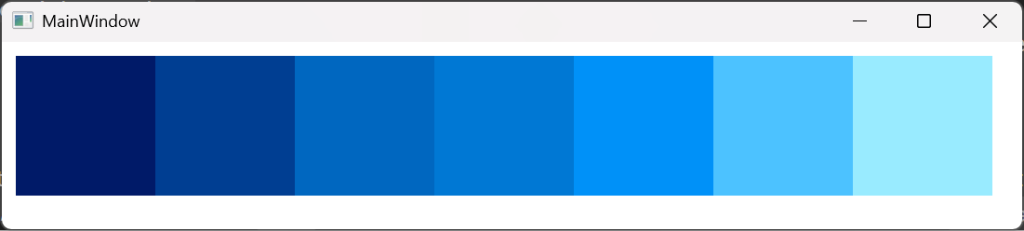
</WrapPanel>As you can see in the code snippet above, the static AccentColorBrushKey property and its light and dark variants are used with the DynamicResource markup extension to set the Background properties of some Border elements. The WrapPanel has defined a width and a height of 100 for these Border elements.
When I run the WPF app, it looks like below. There you can see in the middle the accent color that I have selected in the Windows Settings, and left from it the dark variants, right from it the light variants.
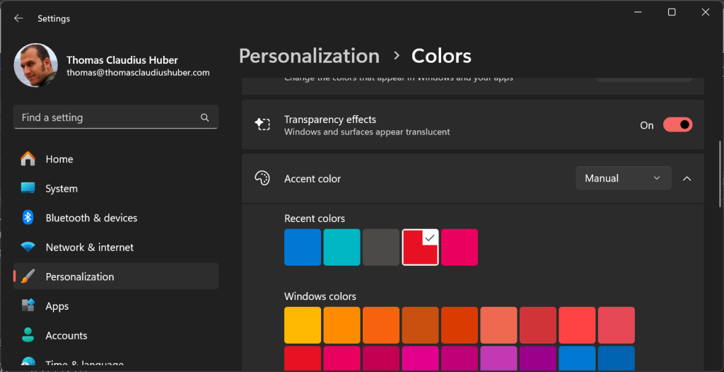
Now let’s go to the Windows Settings app while the WPF app is running. There I change the accent color to red like in the screenshot below.
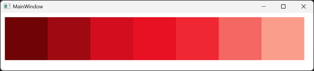
The running WPF app detects that change and immediately shows the new accent color, as you can see in the screenshot below.
Summary
Since Windows 10, a user can select an accent color in the Windows Settings. With .NET 9.0, you can use this accent color in your WPF apps to reflect the user’s settings.
The new static properties in the SystemColors class like AccentColorBrushKey make it simple to reference the accent color in XAML, which means you can use it in your control templates and at any place in your UI code.
Thanks for reading,
Thomas
Comment (1)
Hello thanks for the informative blog. I also purchased your courses on Pluralsight to learn WPF and they were excellent.
I was wondering say if you wanted to hard code a specific accent color that exists in that grid labeled “Windows Colors” for example “Moss”, is there a simple way to set the accent color to this, and then have all the derivative variants be set appropriately? Or is this generally just a read-only thing that matches the users’ selection in Windows Settings? Can we reverse the direction and hard code a specific one of them?